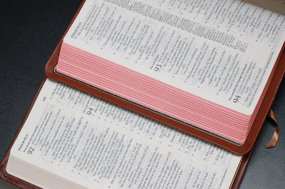
Using the flash to "bring out" the different grain of the covers. Personally, I really think Crossway's Cordovan Calfskin has the "coolest" look.

Almost identical typeface. Allan's papers do feel thicker under the fingers and visibly less bleed-thru too.

Another pix to show the different grains. Even Allan's Black is different from the Tan. All are unique, and all are gorgeous. Praise the LORD for all these skilled craftsmen.
5 comments:
Your cordovan calfskin from Crossway is much grainier than any of mine. I like it. Great photos -- I'm glad to see you keeping this up.
Thanks Mark.
Wow! Nice flashwork. They all look nice. I'm partial the ESV1 black but the Crossway cordovan calfskin does look appealing.
Thanks AJ. The Cordovan calfskin is STILL my favourite.
Post a Comment